

 Follow me on :


Work
 Next Project
 Previous Project
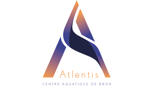
Project 02: Atlentis Global Branding (2017)
 Scroll
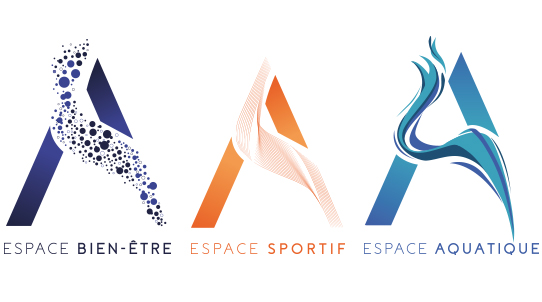
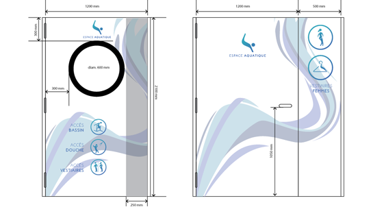
The Bron aquatic center inaugurated in the city of Lyon in 1973 was renovated in 2007. Three new different areas were created (Aquatic, Sports, and Spa). I was asked to help the center to stand out and also to improve its brand image. I had two constraints : make feel the aquatic center accessible to everybody, and remind the aquatic center history. I had to rework all the brand from scratch (global reworking and design).
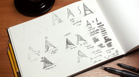
Approach & ProductionFormerly called André Soucis, I had to find a new name for the aquatic center because of the old-fashioned image that the center gave to everyone and to resist competition. The concept is simple: create a ligature between the A and S (from the older name). That way we had the logotype. The first glyph (A) represents the physical door of the aquatic center and refers to a triangle which has 3 sides like the 3 areas. The spine of the S glyph has been used to finalize the logotype and it refers to a way or a cascade. Modifying the spine for each area allowed me to create a modular logotype. All the concept is about the spine. You can now watch the animated logotype.
SoftwaresRoughs /Adobe Indesign / Adobe Illustrator / Adobe Photoshop / Adobe AfterEffects